The Problem
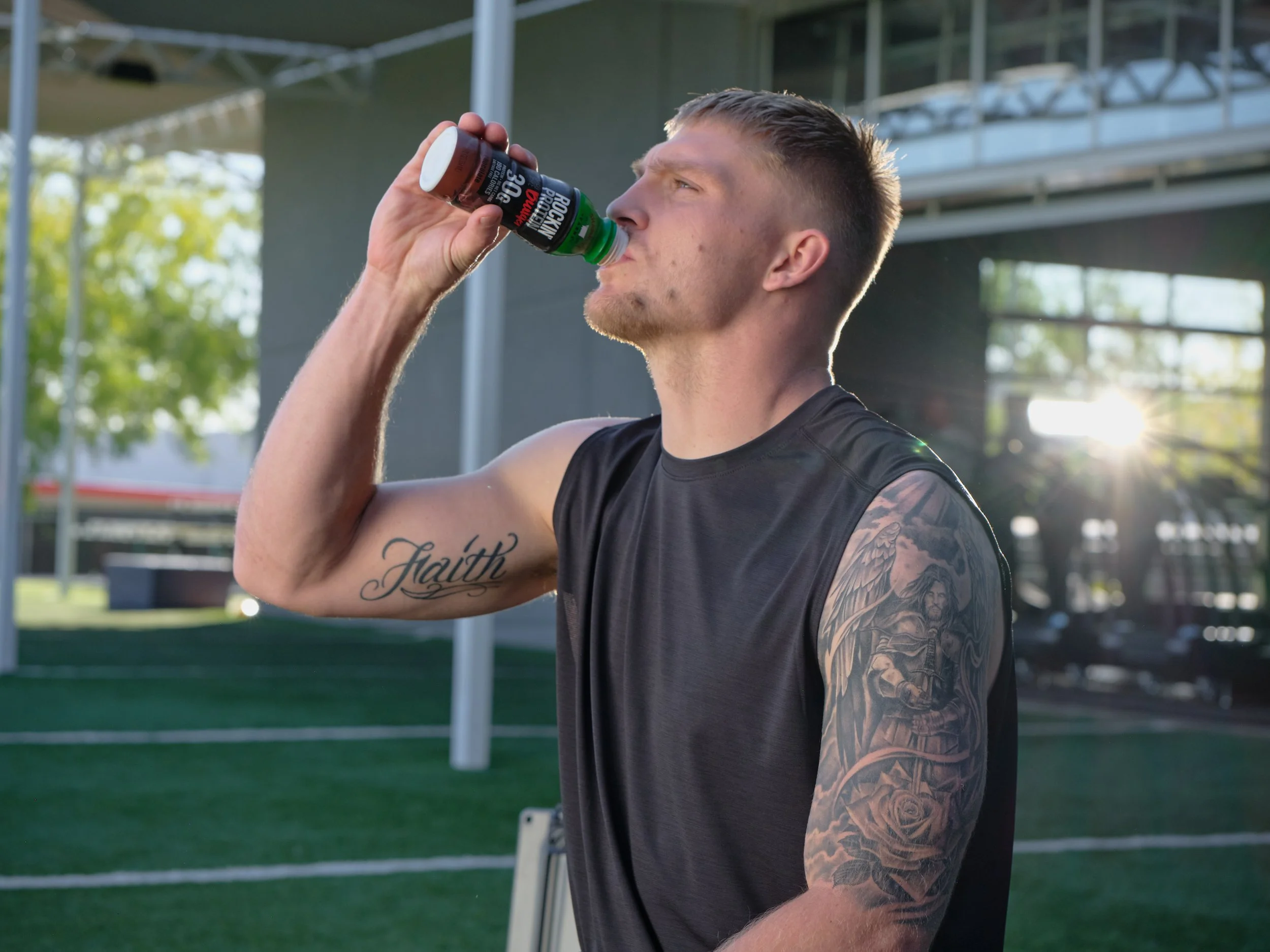
Rockin’ Protein lives at the intersection of fitness, nutrition and taste, but the brand needed a presentation style that could communicate all three without falling into the typical sports nutrition look.
The Solution
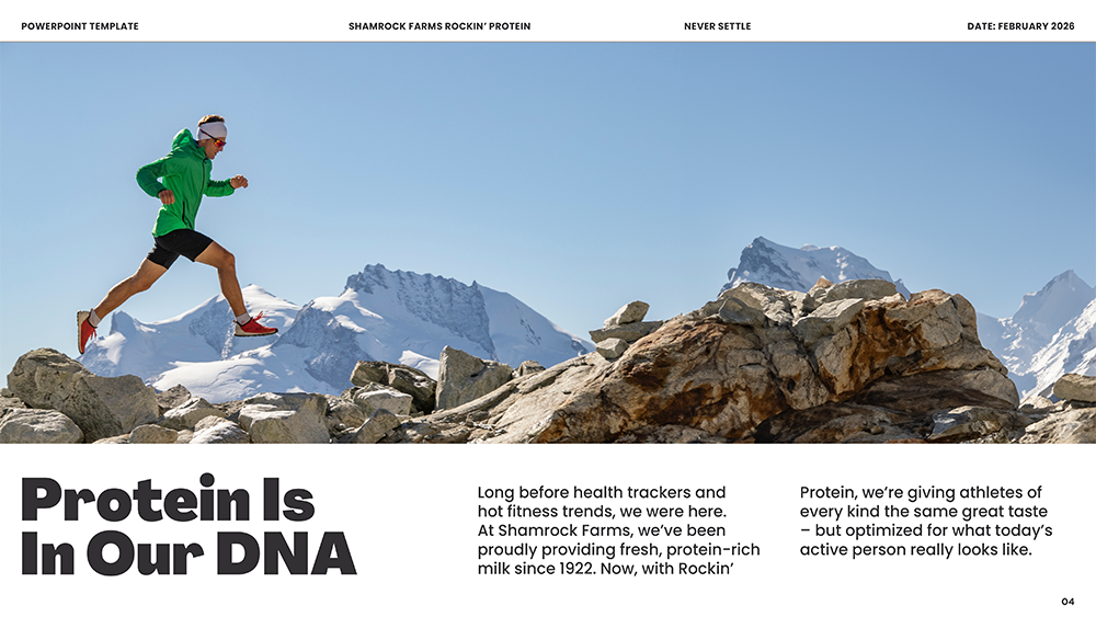
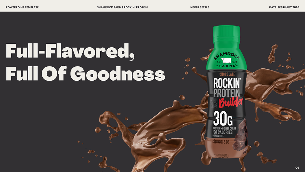
We leaned into the contrast between powerful protein and delicious dairy, creating a bright, high-energy visual approach that made the brand feel less like a supplement and more like something you would actually look forward to drinking.
The Smoke
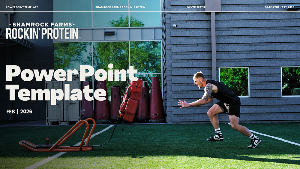
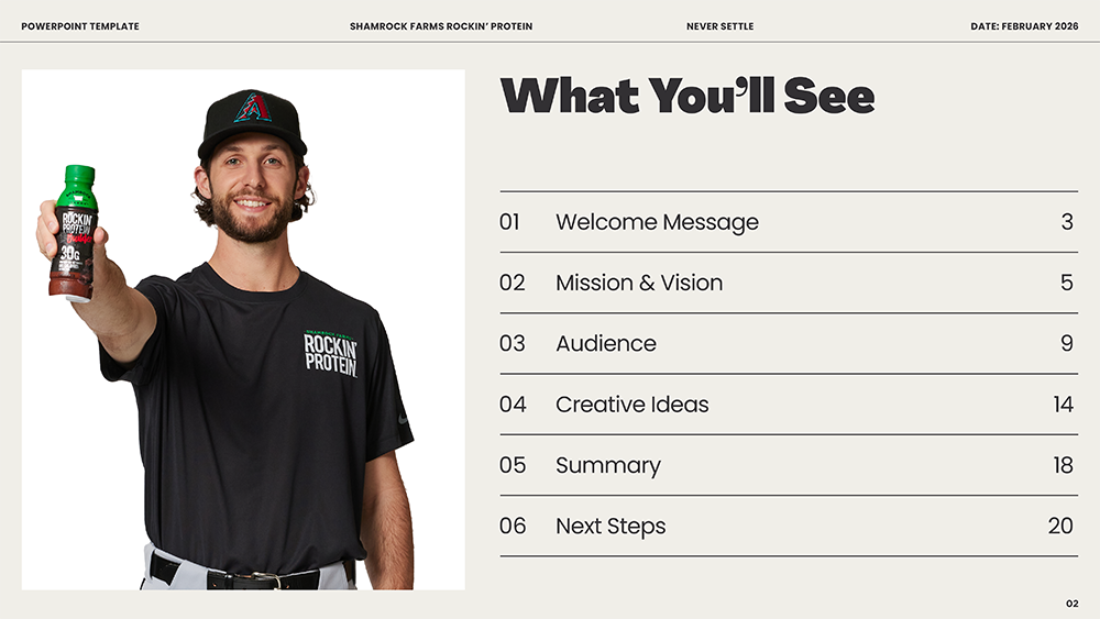
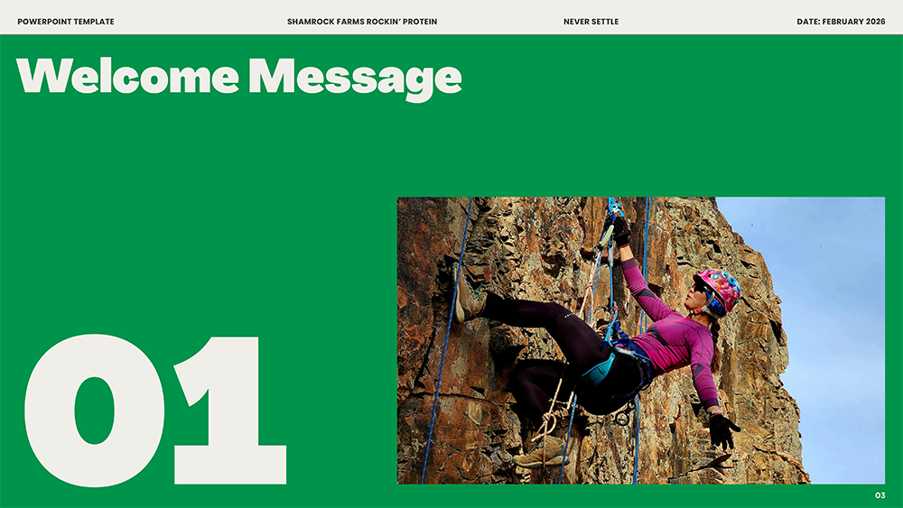
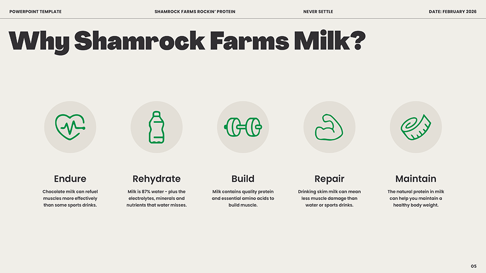
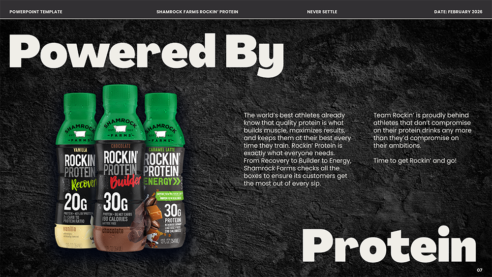
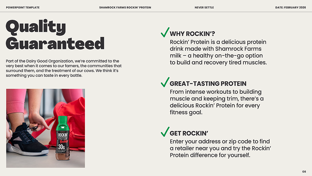
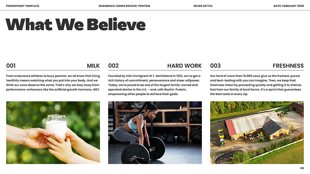
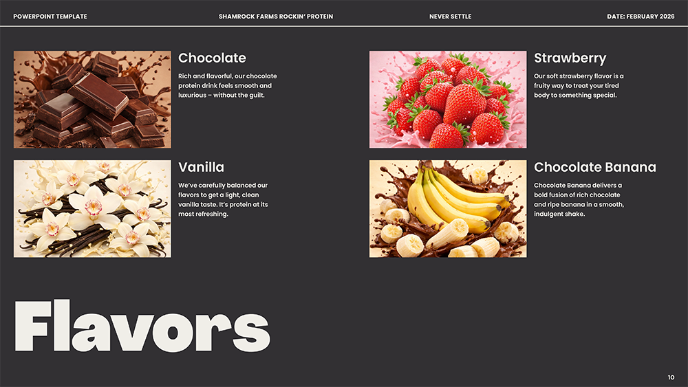
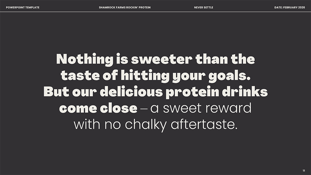
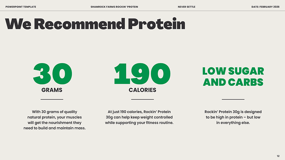
For the Slide Design, I created a flexible system that could move between product benefits, nutritional information and larger brand moments without losing energy. The layouts were designed to feel active and motivating while keeping Rockin’ Protein’s real-milk story at the core.